
I love entertaining. As I mentioned in my very first Open Letter, my mom and dad raised me in a house with an open door policy and trust, the door kept swinging! The stove always had of pot of something simmering (like Gumbo) and the bar always had a bottle of something pouring.
These days, people entertain less because they find it cumbersome, expensive and time-consuming. I don’t disagree with any of those arguments; however, I would counter that entertaining at home is also heartwarming. There is something that happens when you throw open the doors to where you live, invite people into your personal space and make them feel comfortable. You connect with friends and family in a way that does not happen in a bar or restaurant.
In addition to other soirees, a few times a year we host an old fashioned dinner party with a proper cocktail hour, 3-course meal, dessert and after dinner cordials.
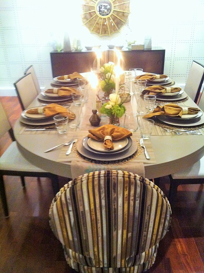
Since the heart of the dinner party happens around the table, serous effort goes into the table décor. To save time the day of the party, I typically set the table the day before. This also gives me a chance to assess what I already have and run to the store to pick up anything additional I may need. The less you have to do the day of the party, the better!
Here, an elegant table with a touch of whimsy sets the tone for the evening. To use the same principles as when I put together an outfit, I don’t like the various elements of a dinner table to match but I do want everything to compliment each other. Also, don’t feel as if you need to break the bank to create a memorable, eye-catching table decor. Expensive tabletop items are luxurious if you can afford them or want to splurge. But mix in inexpensive and cheeky items from big box stores like Target and Walmart for a high-low look that will leave guests wondering, “Hmmm, is that ‘Tar-jay’ or L’Objet from Bergdorf’s Home Section.” A little mystery is enchanting.
Finally, please don’t use a matching set of dishes or even flatware for that matter. It’s the equivalent of wearing taupe head to toe in the same shade, fabric and designer…boring, predictable and blah blah blah! For example, on the table below, the warm taupe salad plates provide contrast to the cool blue dinner plates. The salad plates also pick up the off-white/taupe tones in the striped placemat and provide the perfect flat base for my famous “Kale Caesar-less Salad with Multi-Grain Crumbs.” If I used the matching blue dinner plates, the table would look flat instead of layered.
Now the fun part, the following deconstructs this tabletop bottom up:
Table Runner: The Clara Table Linen runner with embroidered leaves is the base for the table decoration. I love the light teal blue because it adds a cool touch of whimsy and color to an otherwise neutral tablescape.
Placemats: Chilewich Multi-Striped neutral vinyl placemats from Sur La Table set the foundation for each place setting. If you look closely, the striped placemat picks up the embroidered leaves on the runner. Because they have the same neutral tone, they complement instead of clash and keep the eye moving with the different patterns. Next, I layered Chilewich Pebble Placemat in gold. The circular pattern relates back to the runner, ties in the gold tones and softens the edges of the square striped placemats. The negative space of the circular placemats also keeps the setting from looking heavy.
Chargers: The chargers are gray wood veneer. They remind me of a weathered beach house, add an earthy element and dress down a table that would otherwise feel far too stuffy.
Dinner Plates: The dinner plates are a discontinued French blue glazed ceramic plate from Crate & Barrel. Similar here. We have owned these plates for over 10 years, have had thousands upon thousands of meals upon them and continue to throw them in the dishwasher everyday. Although they are old everyday plates, they blend seamlessly with the tablesetting and wink to the blue embroidery in the table runner.
Salad Plates: The salad plates are inexpensive everyday taupe plates.They pick up the taupe in the striped placemats perfectly and contrast the cool blue tones in the dinner plates.
Napkins: The napkins are sateen gold. They speak to the gold in the round gold placemats but don’t perfectly match as the napkins are warm coppery gold.
Napkin Rings: The napkin rings are Mother-of-Pearl with brass gold edging. The taupe, cream and gold pearl inlay wrapped in gold bring everything together while adding that touch of elegance to the place setting. You might be tempted to say, “Forget the napkin rings. My guests will take them right off and then they will be in the way.” Resist the urge! Napkin rings are the jewels on your table and provide that bit of sparkle.
Flowers: The flowers are three small bouquets of roses, greenery and moss in small bud vases from my friends at Langdon Florist. They add a touch of freshness while being low enough in scale to allow conversation flow amongst guests.
Candles: I used a variety of candle heights to create depth and different lighting. There are four off-white tapered candles in art deco brassy gold holders scattered on the table. Tapered candles always introduce elegance. The three tea light candles in gold frosted votive holders add depth. Similar here. Always light the candles and dim the harsh overhead lights because each of us can use a little candlelight glow.
As you can see, while every detail is well thought out, nothing is extra fancy or precious. If a guest spills a drop of wine or a morsel of food, who cares. The stains on the napkins and the placemats live on forever to the tell the tales of the night.
[huge_it_portfolio id=”7″]